De Stijl Research

De Stijl originated in the Netherlands and was pioneered by Theo van Doesburg in the mid 1910’s. One reason the movement was concentrated to the Netherlands more so than other movements like Cubism was because the Dutch could not leave there country having not participated in the war.  De Stijl was l

lead by Theo van Doesburg

Theo van Doesburg – Arrhythmic Composition, 1930

Huszar help put down the foundation of De Stijl. Their philosophy was all about stripping down form to its basic elements. Not even circles were aloud. Everything had to be rigidly square and flat.

Vilmos Huszar – The Mecano Dancer, 1922

The most famous artists associated with De Stijl however, was Piet Mondrian, who painted a black grid and coloured in the squares with the primary colours. He really enjoyed this and spent his whole life pursuing it’s limitations.

Piet Mondrian – Composition in Red Yellow and Blue, 1921


I suppose De Stijl is a reflection of how constricting war is. As the artists involved in this movement would have either been involved in World War II or affected by it it, De Stijl serves to illustrate how cold and relentlessly abhorrent war is.

Theo van Doesburg – composition VII, 1917

De Stijl’s strict attitude towards their principles of design constricted them to only producing non-representational art.  But it was not constrained to this time period and De Stijl has gone on to inspire future artists and architecture. The  Rietveld Schroeder House is a brilliant example.

Bart Van der Leck – Composition no.7, 1917

Personal Study 
9a63d-destijl

Surrealism

Surrealism was renowned for its strange dream-like representations. Artists belonging to this cultural movement were notorious for juxtaposing paradoxical subject matter. Such is the painting ‘a Son of Man’. We are use to seeing appleas interpreted in still ife’s but covering the face of a suited man is unique and novel.

Rene Magritte – Son of Man

Many who were not familiar with the Surrealists during their era, may have been taken aback by the outrageousness  if they were not already familiar with other avant-garde work. Yet surrealism touches upon a topic that, throughout the history of mankind, has not been explored. That of the mind and especially dreams. The artwork below by Miro certainly strikes us as dream-like due to its randomness.

Joan Miro – The tiled Field

Much of the artwork generated by the surrealists were influenced by the writings of Sigmund Freud and Carl Jung, amongst. Ultimately Surrealism is all about the exploration of the mind and the psychology of the human condition. Salvador Dali’s art is particularly dedicated to this study. The Persistence of Memory serves as a visual metaphor for time. It suggest ants as death and related them to time. That time, which melts, like wax, and slip away from us.

Salvador Dali – The Persistence of Memory

Many writers of the period were involved as well. In fact, the movement was founded by Andre Breton who was a key figure in bring artists together under the same banner. Andre was to write the Surrealist Manifesto in 1924. The photographer, Man Ray, is famous for taking this beautiful and surreal photograph, juxtaposing the female figure, likening it to a violin.

Man Ray – Violon d’Ingres

Max Ernst – The Elephant Celebes

A hybrid between Surrealism and Dada, this painting was painted by Ernst in 1921. This was a tumultuous time, between two world wards and during the great depression. There was a lot of radical politcal and economics change and this painting, I feel, illustrates the underlying effects. The mechanical elements of the elephant, mixed with the greys and a naked, broken figure of humiliation reflects the mood and attitudes towards the time.

Personal Study
10718962_10154787369305122_1662806400_n

Dada

The Dada movement, set up in the mid-1910’s, was a response to the horrors of World War 1. It gained its grounding in Zurich before spreading to Berlin, New York and other major world cities. The attitude that Dada artists had in response to the war would have been humorous and absurd but also very serious. Where comedy often entertains and enlightens, this sort of comedy set out to ridicule how ridiculous war is.
One target was the industrialism that had spawned a machine era. The subject matter Dadaists drew inspiration from was often mechanical and political. Voltaire would have been proud of the satirical nature the Dadaists imposed upon society.
Artists Francis Picabia focused on typography and mechanical forms. He had been influenced by impressionism before, and so brought colour and high contrasts to his work. Picabia was to play a key role in fusing Dada as a world movement, working in the USA and France, in literature with Andre Breton and Gertrude Stein alongside his painting.
Machine Turn by Francis Picabia – 1916-18:
Dame! Illustration of magazine ‘Dadaphone’ by Francis Picabia – 1920:

Marcel Duchamp gained fame for his scandalous mockery of social attitudes with artworks like ‘Fountain’. Based in New York at the time, Duchamp was president of the Society of Independent Artists, a leading avant-garde society that sought to be open to anyone. However, he resigned at the rejection for his fountain, true contradiction of what the society stood for.

Marcel Duchamp, Fountain – 1917:

Hannah Hoch was a well connected female Dadaist based in Berlin. She is famed for her collage, photomontage work and relationship with fellow Dada artist Raoul Hausmann. Much of her work is critical of mass culture beauty industry in an age where fashion and advertising were gaining momentum and power over western cultures.

Cut with the Kitchen Knife through the Beer-Belly of the Weimar Republic by Hannah Hoch – 1919:

Grosz was a political artist, anti-nazi and a member, for a couple of years, of the Communist Party of Germany. His artwork is a reflection of his political stance and in this piece it shows caractural people with mechanical parts and numbers waving a German flag in an metropolis backdrop. This epitomizes what Dada is all about. It is a mockery of war, oppressive politics and nationalism.

Republican Automatons by George Grosz – 1920:
Personal Study

Futurism

 Futurism is thought to have originated in Italy in the early 20th century. It has connection with Fascism and became popular amongst Russian artists too. Cubism would have influenced Futurism and other art movements that sprung from it were Vortism, Art Deco and Constructivism.
Futurism uses the distortion of perspective with emphasis on motion and rhythm. The use of colour is often bright and intense, with streaks of different hues sitting next to one another. Forms are angular and sharp – very offensive.
The subject matter is really what defines Futurism as it is all about the future of society and the way of life. If you think that at the time World War One was happening as well as rapid technological advancement and mass industry, this is what Futurists were portraying in their work.
Umberto Boccioni, Dynamism of a Man’s Head
 
This man’s head is very disfigured and the mood I sense from it is one of anguish and anxiety. You can see this in the eyes.

Boccioni is probably the most famous artist from this art movement. He perfected a style that is cherished for its dynamism in both form and colour during an era of war and industry.
Natalia Sergeevna Goncharova, Cyclist
Motion! We really get a sense that the bike is moving. The subject is a bicycle – a mechanical object; something that the Futurists loved to paint.
Giacomo Balla, Velocity of an Automobile
 
Again, we see a semi-abstract representation of a machine. The curves and lines slicing through each other portrays a car zooming past.
Carlo Carrà, Funeral of the Anarchist Galli
 
A truly spectacular artwork in terms of colour, at least. I like how there is so much black, which so happened to be associated with death. But also there is bright reds, yellows and blues that all compliment one another and make it roar with energy.
Luigi De Giudici, deconstruction of a woman
It’s interesting how Luigi has captured the human figure in a mechanical way. It certainly looks stiff and rigid in its structure and the colours are similar to metal and rust.
Personal Study – Nonsense Poem

Here, I have designed a poster of Nonsense poetry in the style of F. T. Marinetti. The theme is about Old Norse language. Several aspects of the typography allude to a connection between it and the Vikings – the runes, the red colour of bloodshed and the phonetic sounds of the nonsense words.

There is a hidden depth to this poem in that, just as this short poem makes no sense, so can we make little sense of the actual Old Norse language, unless we learn it. It is a sign that we are very different in our language despite many English words having roots in Old Norse.

I’ve included the axe as a symbol of their violence and also dripping blood for the same reason as these help connect the mood of the poster with the subject. The typography has been structured to flow with the rhythm of the poem and the colours are brighter where certain words need to stand out more.

Cubism

Cubism

Cubism was a short but sweet experimental movement, pioneered by Pablo Picasso and Georges Braque during the early 20th century before the First World War. It was to coincide with the birth of abstract art and expressionism that was also going on during the time. Picasso and Braque worked so closely together, under the same roof, that the following two paintings are so similar you could get them mixed up.

Georges Braque, La Guitare

Pablo Picasso, Girl with a Mandolin
 
 These two painting are perfect examples of analytical Cubism where the perspective of a scene such as a still life or portrait has been distorted and fragmented. The different angles of view are simply merged in one. The colour is a lot softer and toned down in these painting and I think this works really well as there is not only a conceptual element to Cubism but also a harmonious, natural one.

Duchamp, Nude Descending a Staircase No. 2

 Although not directly associated with Braque and Picasso, like Gris might have been, Duchamp knew other artists connected with Cubism like Francis Picabia and Guillaume Apollinaire, who was a friend of Picasso’s. This painting, Nude descending a staircase, has some interesting angular rhythmic aspects that connect it to Futurism and Dadaism.

Leger is a great example of synthetic Cubism, which came after analytical Cubism. This development focused more on the abstract and geometric forms and used brighter colours. Leger’s painting ‘Man and Woman’ painted in 1921 is often labelled as Tubism for being so Tubular. It is a perfect representation of how synthetic Cubism is viewed.

Leger, Man and Woman

Cubism came and went quite quickly and this was due to the First World War. War was very disruptive and after, new technological advances such as acrylic paint and the Abstract art movement would have over-shadowed further evolution of Cubism.  It is also important to note that movements like these would have been a response to photography as there was less demand for realism in painting.
Personal Study

Following my research into Cubism I set out to create my own Cubist sketch. This is a self-portrait in the style of analytical Cubism. I’ve used my knowledge of perspective distortion and angular geometric shapes to and soft tones to create my artwork. This sketch gave me valuable insight into how this might be turned into a more complex Cubist painting or sculpture.

Impressionism

Impressionism

Manet – the father of Impressionism. He was a pivotal force in the transition from Realism and Neo-classicalism toward Impressionism. The Impressionist of the 19th Century looked to Manet for inspiration. He was one of the first to explore the use of colour in a more emotive way and to paint ordinary scenes such as the one below.

Edouard Manet, A Bar at the Folies-Bergère


Impressionism was all about the colour. New colour innovation during the 19th century lead to the rise of a new breed of painter. Also, the invention of metal paint tubes assisted this movement as it enabled the painter to paint outdoors leading to painting like Monet’s Rouen Cathedral series, as seen below.

Claude Monet, Rouen Cathedral Series

 Just like Impressionism and realism grew from the study of the working land and everyday scenes, Van Gogh also took inspiration from these subjects. He painted A Wheatfield with Cypresses in 1889. This style he developed using the bright colours and sporadic rhythmic brushstrokes in a unique way but typical of impressionists. Van Gogh was only to paint like this during the last few years of his life. During the last 2 years of his life he painted over 400 paintings.

Vincent Van Gogh, A Wheatfield with Cypresses

The aforementioned attitudes and techniques was part of what made Impressionism revolutionary and also controversial to the classical establishment of the Salon du Paris and the Acedémie dues Beau Arts. Several painters took impressionism and developed their own style. Paul Cezanne was one, Paul Gauguin another. They would go on to influence future movements such as Expressionism and Cubism.

Personal Study 
This is my own Impressionist artwork created using Photoshop. The brush marks are very simple and imitate the Divisionist style but depict a painting by Vincent Van Gogh – A Wheat field with Cypresses. The colour variations are complex. I’ve used the accented edges effect to creative the digital look. I’m really happy with the outcome and I think it synthesizes the two style well. There is, due to the digital nature of it, a mosaic look about it, which I think works in its favour.

The Renaissance

The renaissance kicked off during the 15th century. It’s disputable when exactly, but important technological advances would have triggered the right climate for rapid cultural growth. The printing press, invented by Johannes Gutenberg, is one example that would have lead to better communication via increased publications of books. The spread of knowledge was not the only thing. The iron industry grew dramatically as it became easier to produce. Dry docks started to pop up everywhere befitting continental trade and the increase in wealth made the banks very powerful.

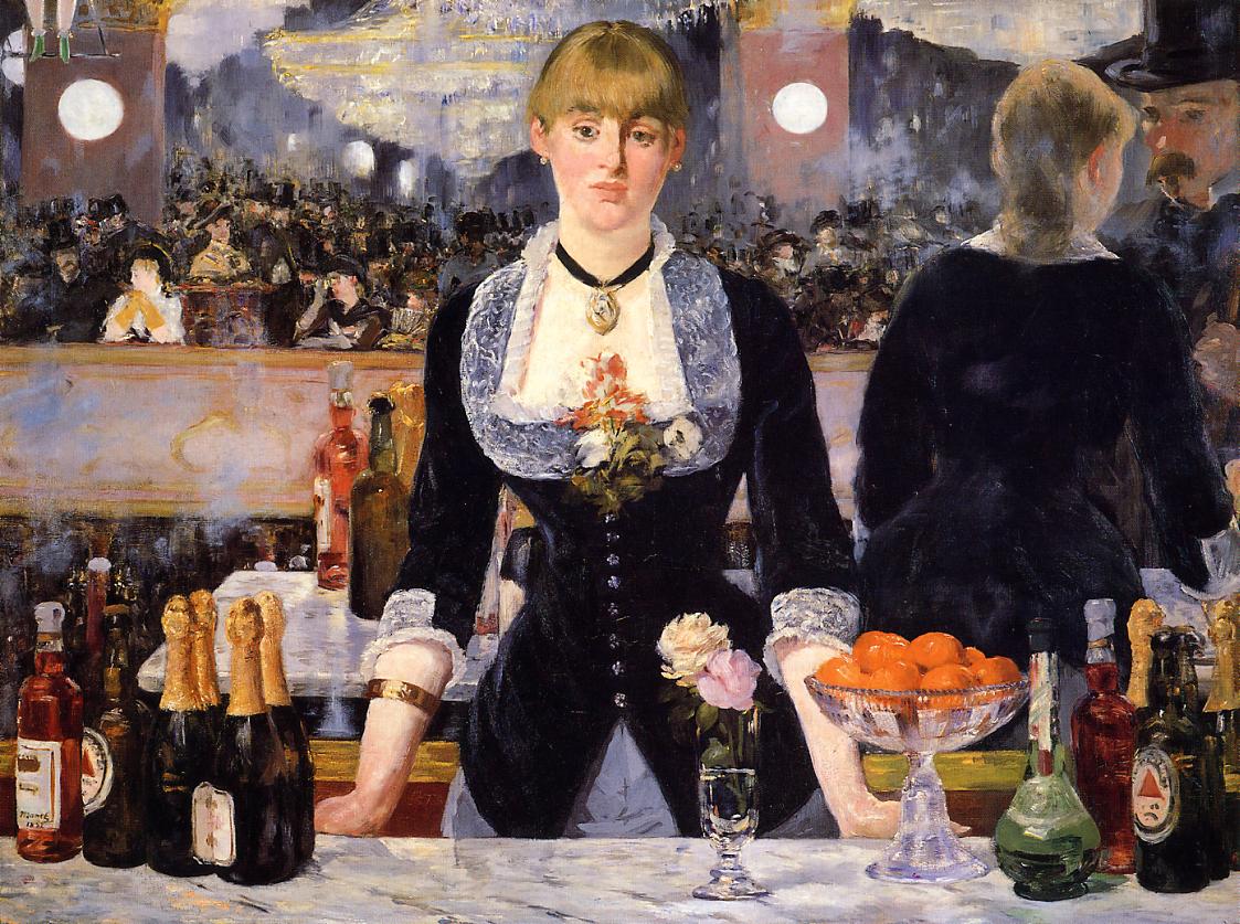
There are two main sources of wealth that helped grow the artistic culture we associate Italy with the start of the renaissance – the church in Rome and the powerful banking family, the Medici, who ruled over Florence. Much of famous portrait and biblical works from this period were likely commissioned by one or the other.

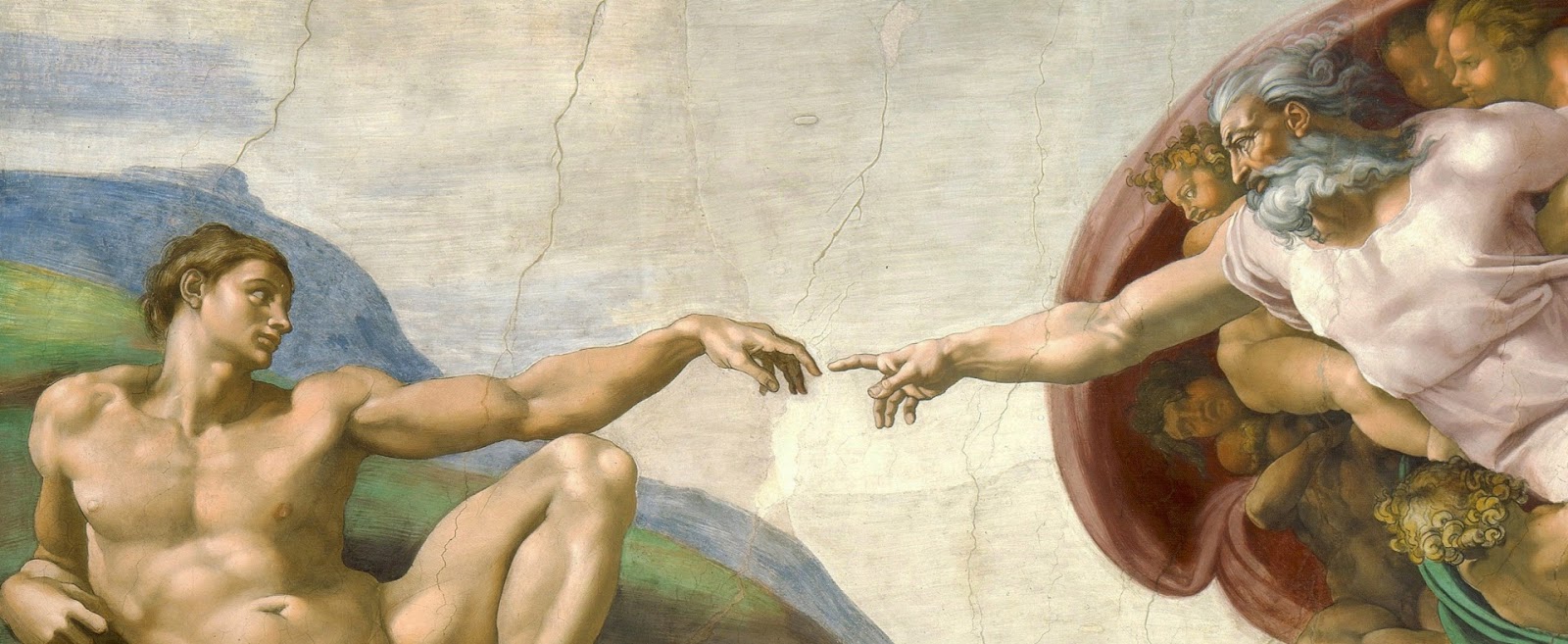
The Creation of Adam by Michelangelo

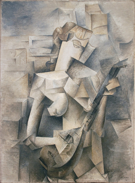
One example of a commission from the church went to Michelangelo to design biblical scenes, frescoes for the Sistine chapel. Frescoes were still very popular during the renaissance, as oil painting had only recently been popularised by painters such as Van Eyck (the Arnolfini portrait) and Rogier van der Weyden (Lamentation of Christ).  Oil painted had become the norm in northern Europe and spread quickly to other regions.

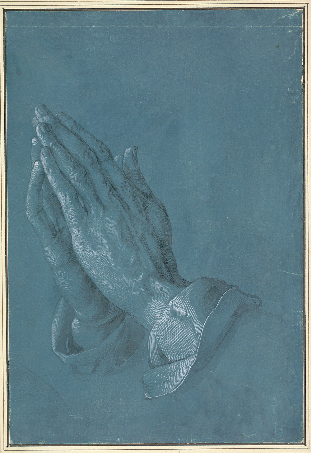
Albrect Durer’s ‘praying hands’:

Here is an example of an artwork from the great northern renaissance. Famous for his etchings and woodcuts, this is an amazingly realistic drawing by Albrect Durer. It was done in 1508, only a few years after Leonardo Da Vinci had painted the Mona Lisa. The drawing epitomizes the quest for perfection and to paint the most realistic artworks. Devices such as camera obsucra were invented to aid in this quest.

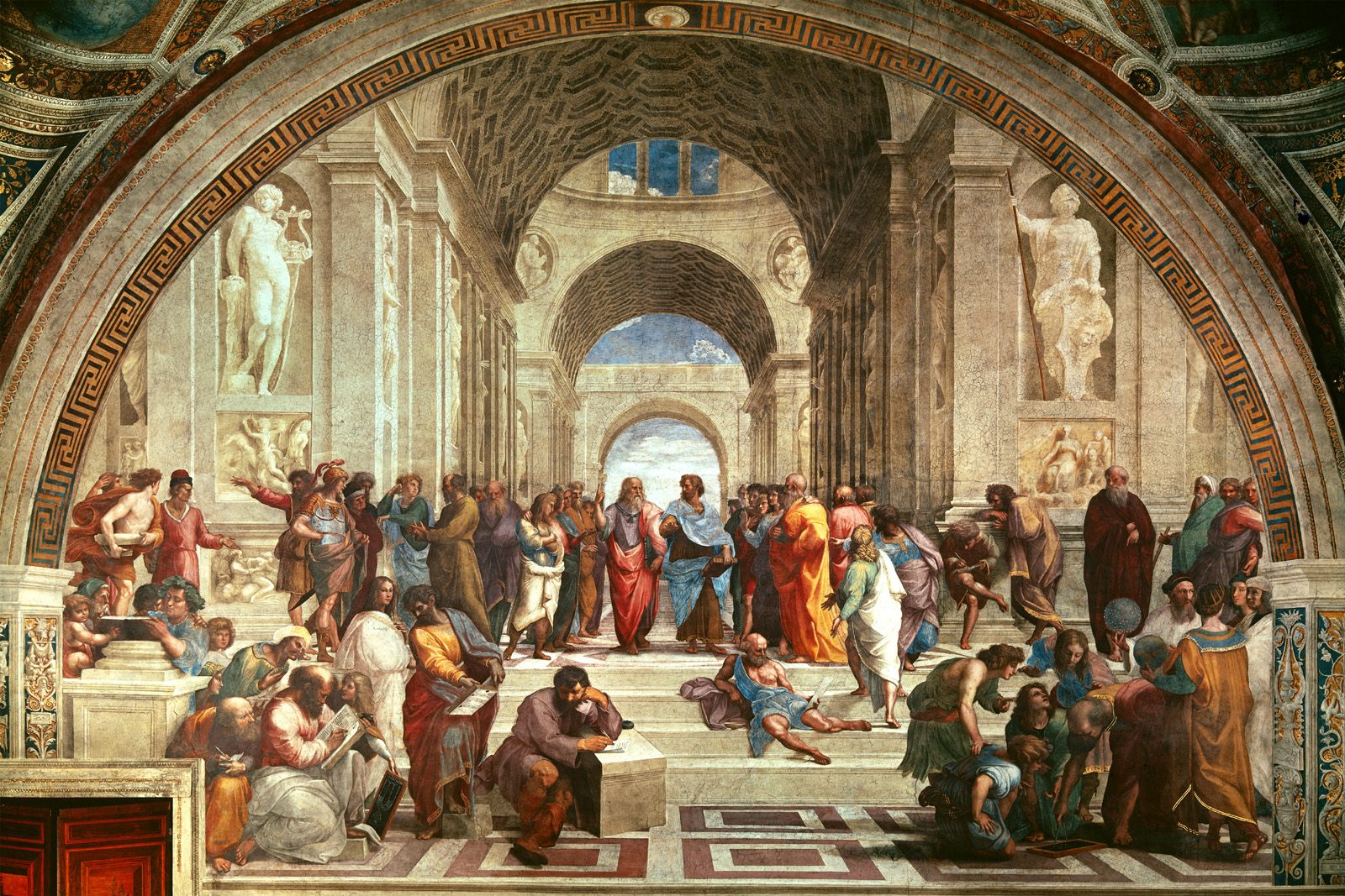
The School of Athens by Raphael:

Considered to be one of the greatest works by Raphael, even the renaissance, this brings together, in a rather educational manner, the great Greek intellects. I can’t help but notice the irony of how Raphael capture the best of ancient Greece, whilst his own time was to become equally as great, himself included. During the high-renaissance, he painted it between 1511 and 1512. Art was so highly esteemed by now that Raphael would have experienced fame amongst his peers for his contributions to the arts.
 

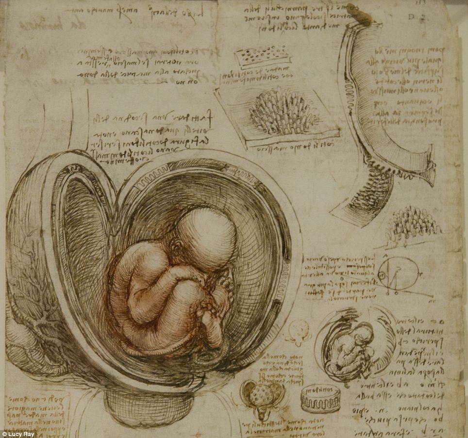
From Leonardo da Vinci’s sketchbook:

To add another example of 15th century artists quest for perfection would be to show you a drawing from Leonardo da Vinci’s sketchbook. This foetus in the womb most likely would have been drawn from the real thing. The humanist movement ran alongside theological views as scientific quest to understand the world from a factual point of view. Talking of point of view, perspective was invented during the renaissance – linear perspective by Filippo Brunelleschi and aerial by Leonardo da Vinci.
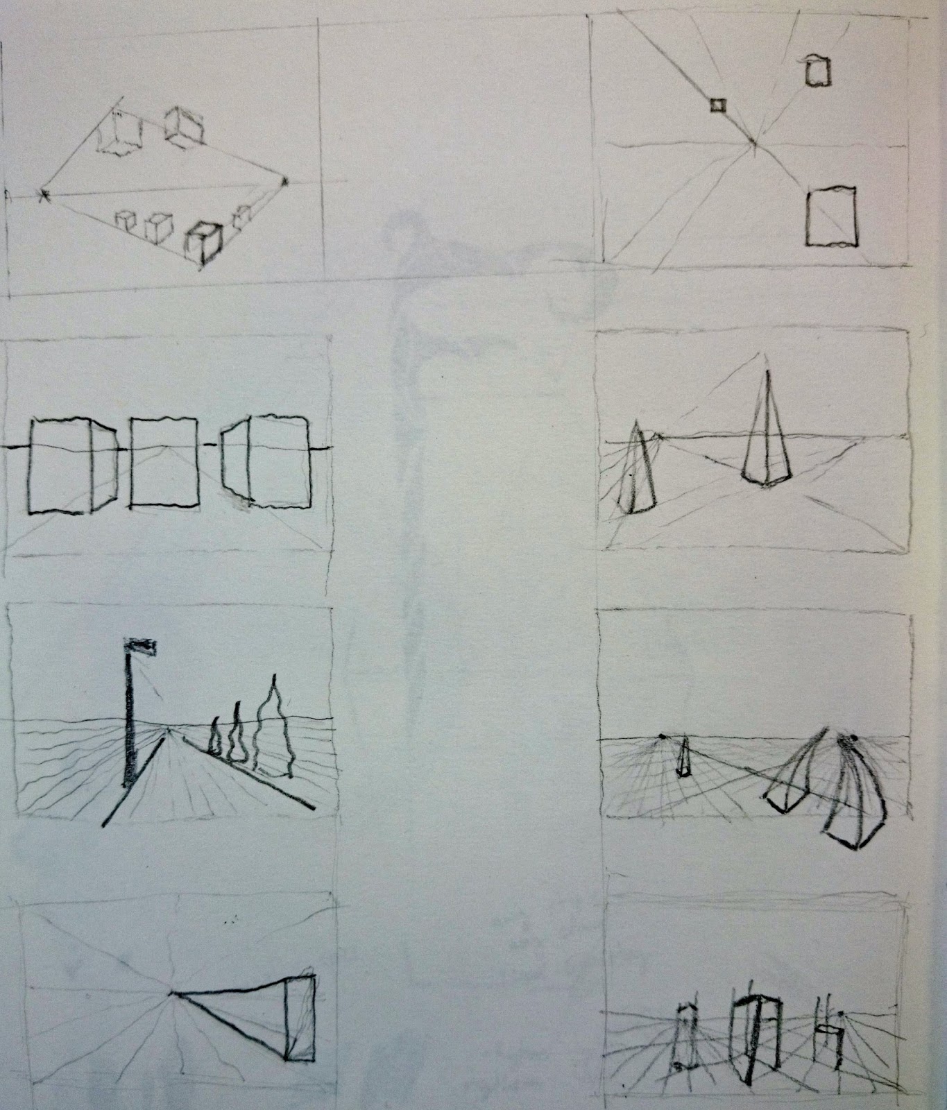
Personal Study
870ed-perspective2bstudy
After researching the Renaissance, I have done a brief study into one-point and two-point perspective. The study culminated in an understanding of how perspective can be employed in detailed and realistic drawings. Perspective enables the artist to capture reality with greater accuracy.
rabbit
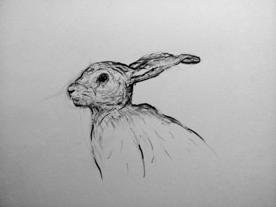
A sketch of a rabbit. I tried to gain an insight into the difficulty of achieving realistic drawing. From drawing like this I have developed great respect for the old masters incredible talent for detail, precision and accuracy as well as modern day realism artists.
boots
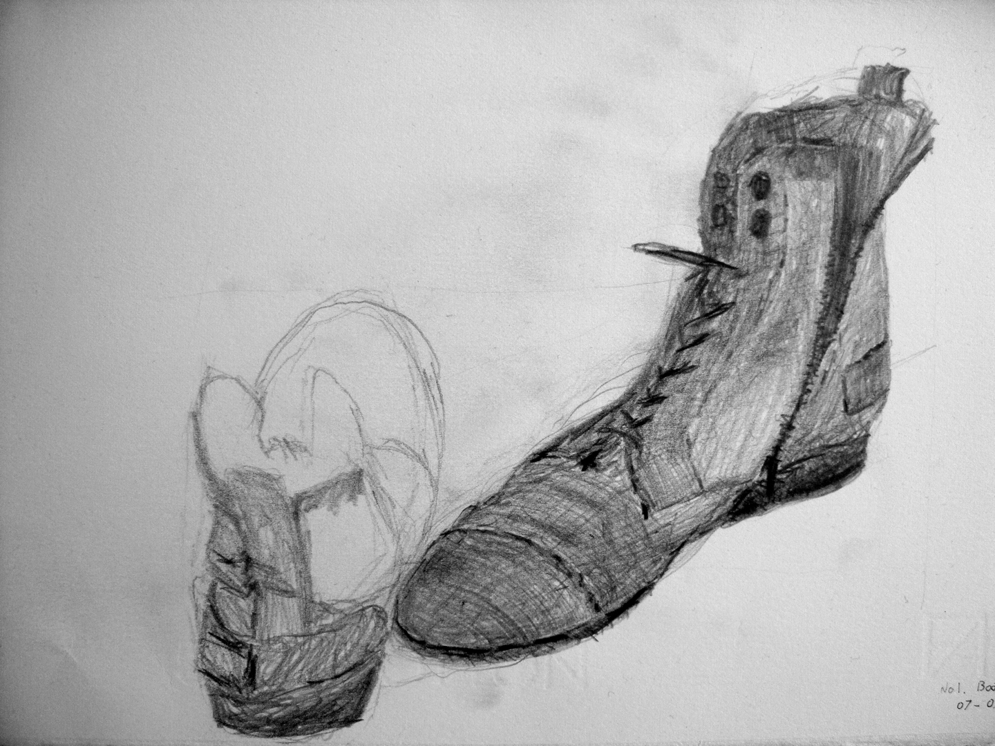
Another drawing – experimental sketch of a pair of boots. The style actually reminds me more of Van Gogh for some reason.
victory-wings
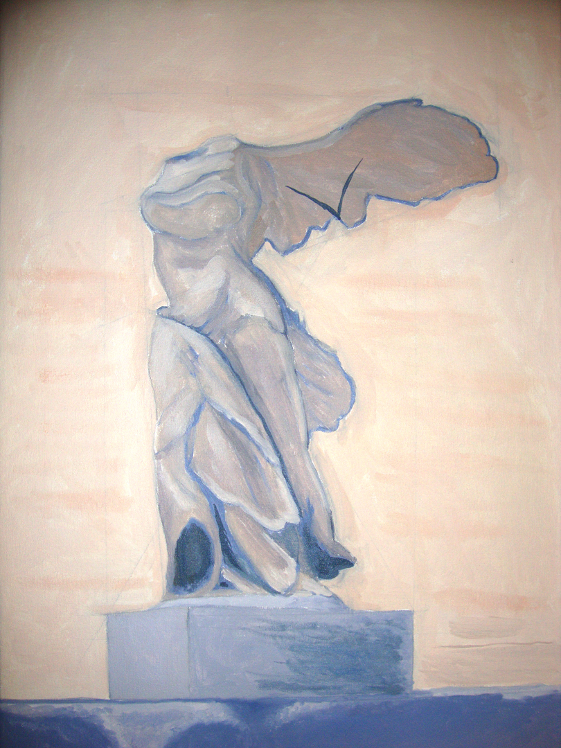
This is an oil painting of the Wings of Victory statue in the Louvre, Paris. The technique I’ve used involved many thin layers of paint. The technique is called glazing and I have managed to do three glazes so far. This is developmental work as it will take a very long time to demonstrate the finished look.
The reason for using glazing was to enhance the brilliance of colour. When light is reflected off each individual layers of paint, the effect is more luminous. This was highly appreciated, when you consider bright colours were often expensive or undiscovered.